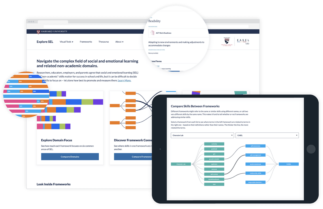
The EASEL Lab at Harvard University approached us with the goal of creating a website to help users navigate the complex and conflicting terminology used in the field of social and emotional learning (SEL). As part of their work, Easel Lab has created a scientifically-grounded system for organizing, describing, and connecting frameworks and skills across the “non-academic” domain. The Explore SEL website we designed and built includes a working thesaurus and interactive visualizations to help users better understand and utilize their research.
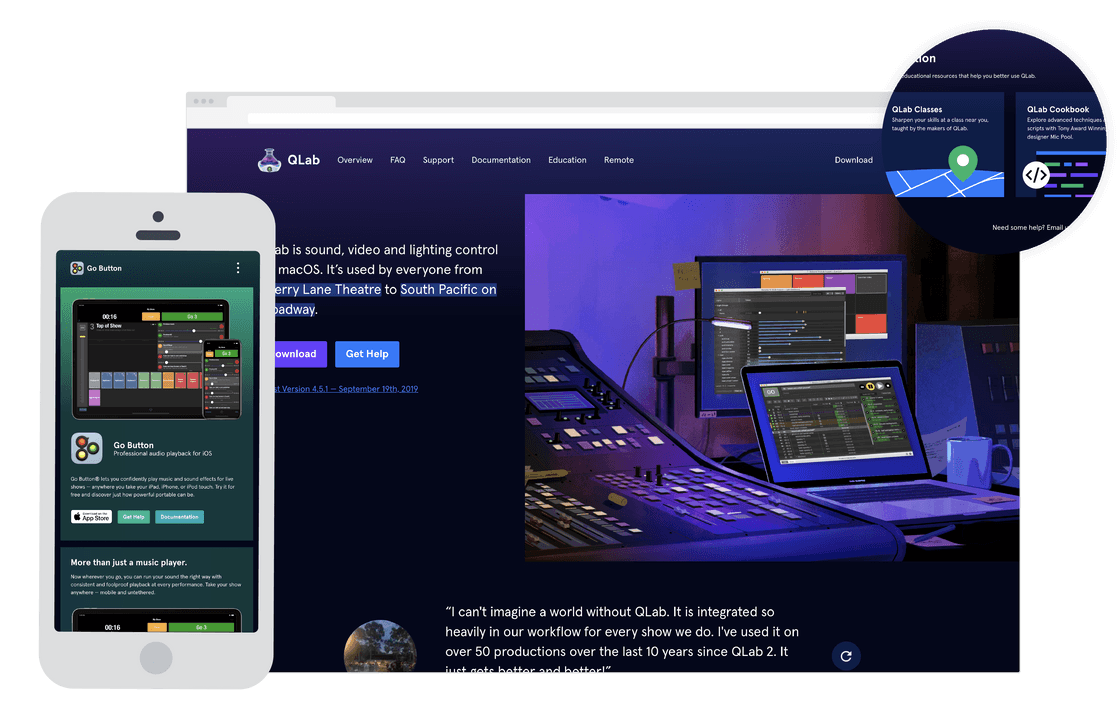
Our longtime friends at Figure 53, known for creating the industry-standard live performance software QLab, reached out to us to collaborate on a redesign of their web presence with the goal of creating a more sustainable and efficient site that better represents the company and its employees. We facilitated a Discovery process with Figure 53 to establish a shared understanding of the values and priorities of the company, and to enable a more holistic approach to the redesign of each site under the Figure 53 umbrella. A unique challenge of the project was disentangling QLab's identity from Figure 53's — separating a reliable, focused, professional-grade product from the squishy human beings that make it.
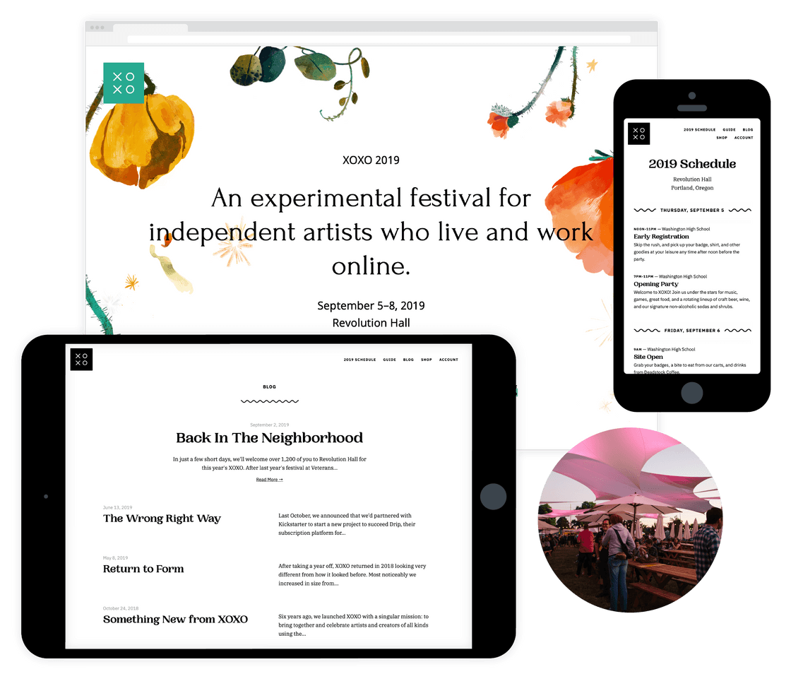
XOXO is a community-driven, experimental annual festival in Portland, Oregon celebrating independent artists who live and work online. As the XOXO community and event have grown, so has their need for a more robust website designed and built to quickly convey their mission, history, and resources for new and returning festival attendees. We worked with "the Andys" to build a unique lottery-style registration system with a fully custom admin panel in addition to the public-facing site for the festival.
Photo Credit: Searle Video
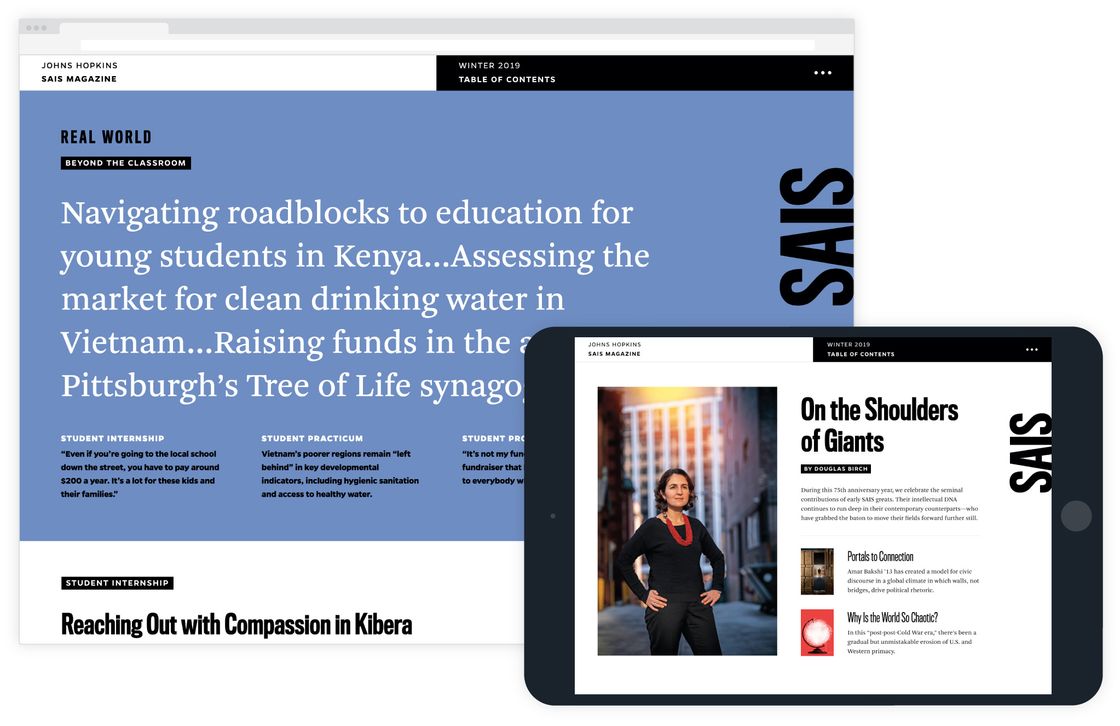
Translating the design for a physical publication, in this case the magazine for the Johns Hopkins School of Advanced International Studies created by the talented team at Skelton Sprouls, to the web presents unique challenges. We were brought in to design and build a site that could be easily updated with future issues, but that wouldn’t have a "templated" look, with all of the content squeezed into a boring blog-post style layout. We ended up using Gatsby JS to build a simple but flexible system that strikes the perfect balance.
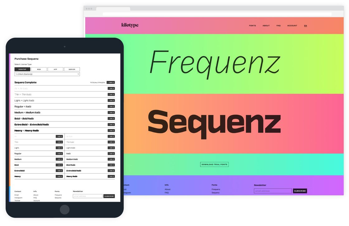
Expanding on our partnerships within the type design industry, William Montrose and Sebastian Losch came to us in early 2018 with the goal of starting their own foundry: Kilotype. We worked together to design and build a storefront for their debut families, focusing on getting them up and running quickly and affordably and building an application that will grow alongside their business. This project gave us the opportunity to use interactive, variable fonts and a swath of bright colors to set the tone for William and Sebastian’s new endeavor.
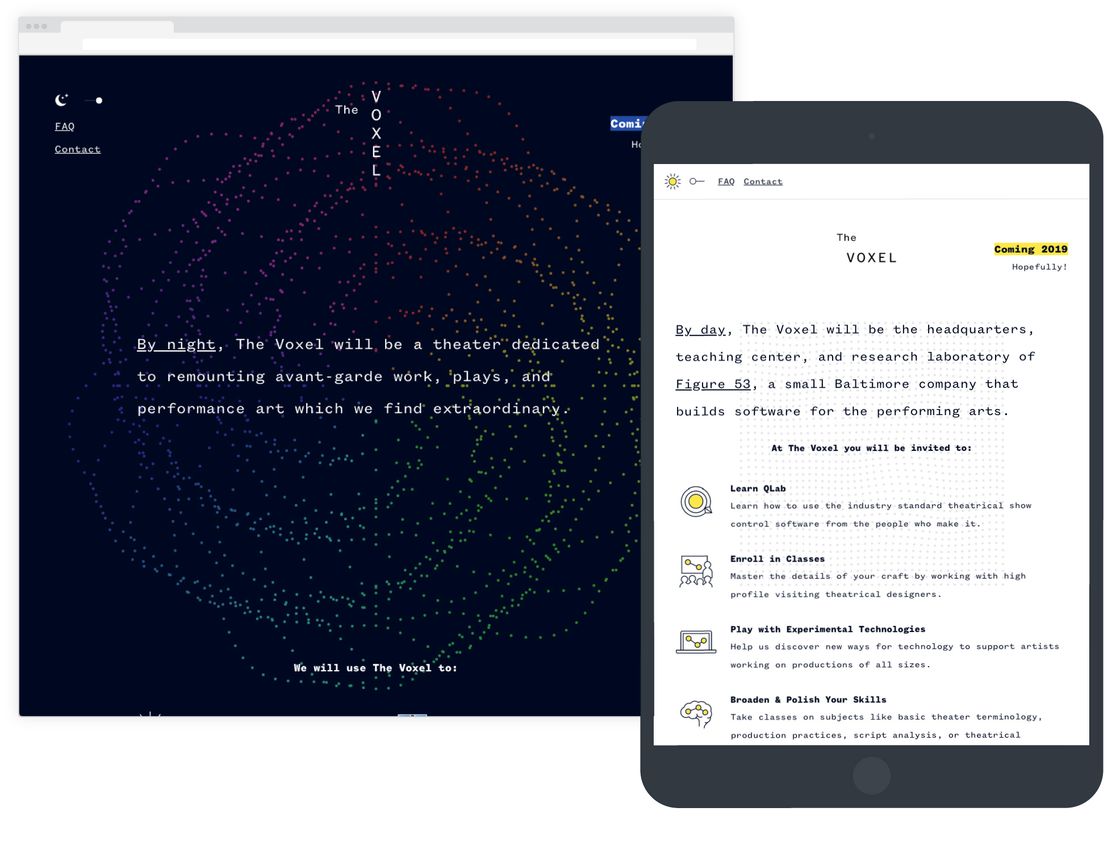
The Voxel is a blackbox theater and multipurpose space built by our friends at Figure 53. The website we designed represents the building before it opens in 2019 and is tasked with communicating Chris and Lola’s ambitious, still-evolving plans to Figure 53’s customers, local artists and theatergoers, and The Voxel’s neighbors in Old Goucher. Dividing the site into daytime and nighttime missions expresses the space’s dual identities in a playful and engaging way.
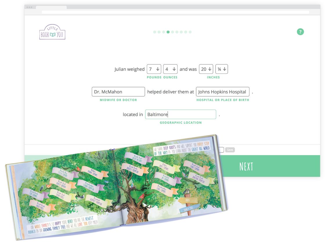
Marina and James Cummins approached us in early 2017 with the goal of selling one-of-a-kind baby books, each personalized to a specific child, to a variety of customers. Working with illustrator and graphic designer Dan Dingman, we designed and built a unique e-commerce site which includes a survey for parents, friends, or family members to share details about the newborn. This data is then used to automatically generate a custom-tailored PDF which is sent to a third party to be printed and delivered. Since its launch in November 2017, we’ve continued to work with James and Marina to improve the site and provide customer support.
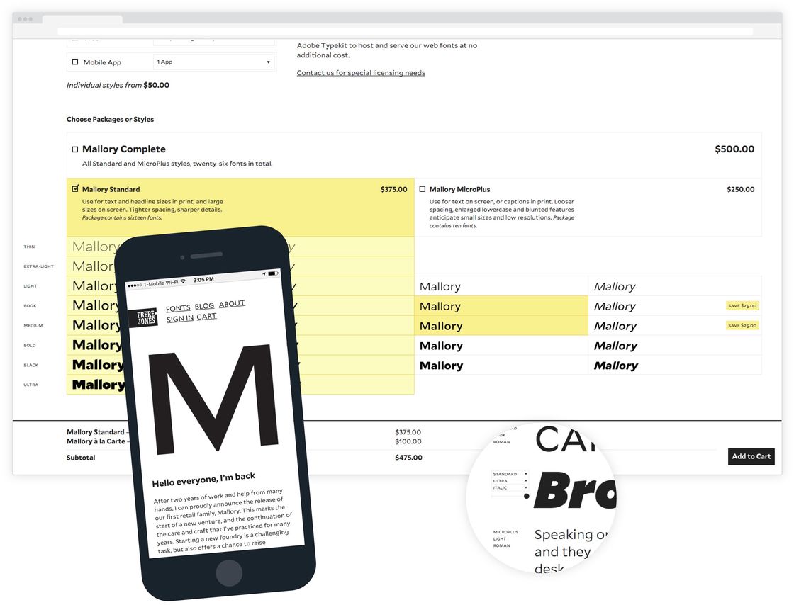
Throughout his extensive career, Tobias Frere-Jones has proven himself to be one of the world’s most prolific type designers. When he decided to go independent and start his own foundry, he contacted us to design and build his new website. We designed the site to direct as much attention as possible to the type itself, with the interface receding into the background. One of our main focuses was making the complex pricing system for various combinations of licenses and type styles clear and intuitive.
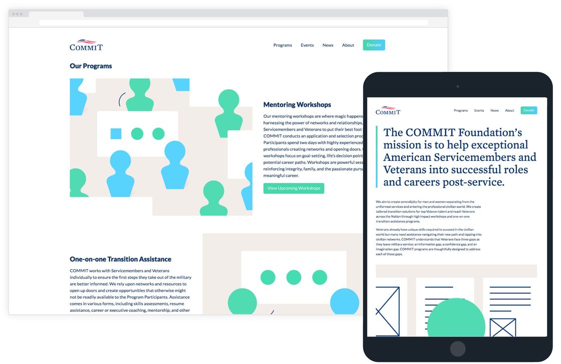
The COMMIT Foundation’s mission is to help veterans transition from military service into the civilian workforce. Since 2014, we’ve had the privilege of helping them by designing, building, and maintaining their site, which has grown alongside COMMIT. Because of a lack of photography, we’ve established a visual language and made simple, looping animations to represent COMMIT’s different programs.
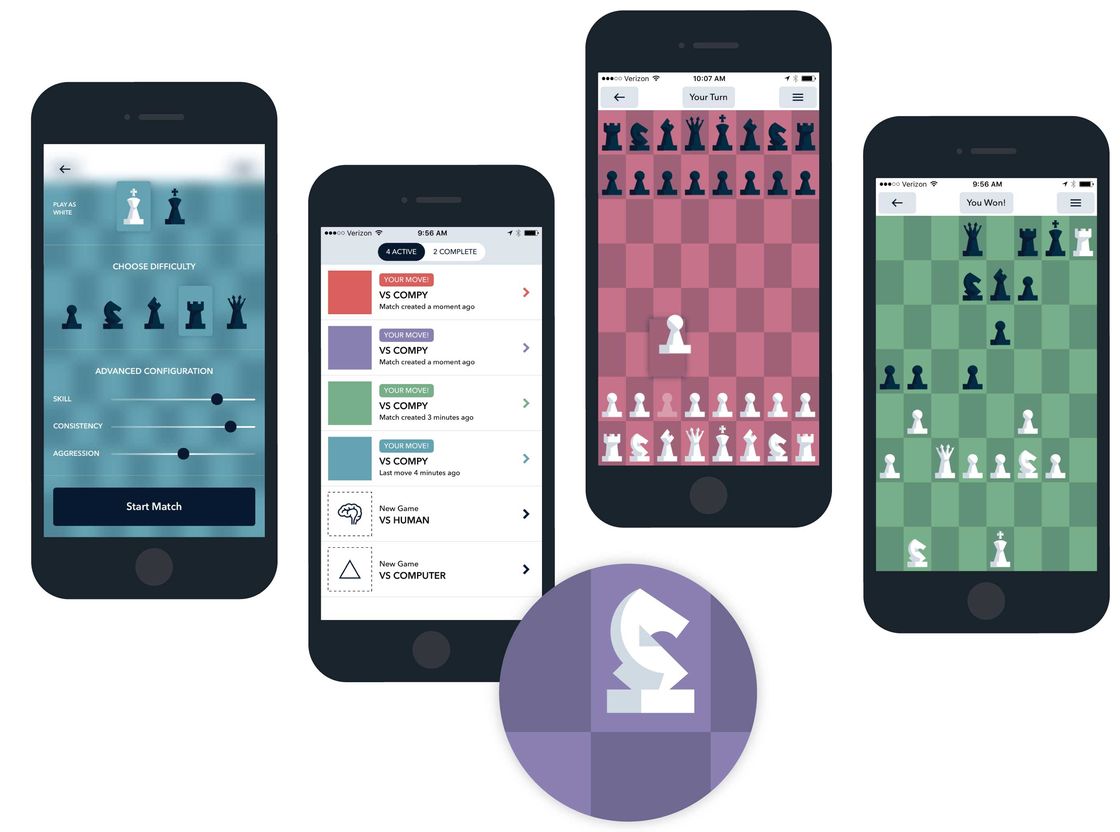
Disappointed with the quality of chess games available in the App Store, we set out to build our own in 2013. The rectangular board, a distinguishing feature of Tall Chess, allows for height variation between the pieces which improves board readability, creates larger tap targets when making a move, and makes the best use of the entire screen of the device, encouraging players to focus on the game. Tall Chess allows you to play with other people through Game Center or locally against a configurable AI.
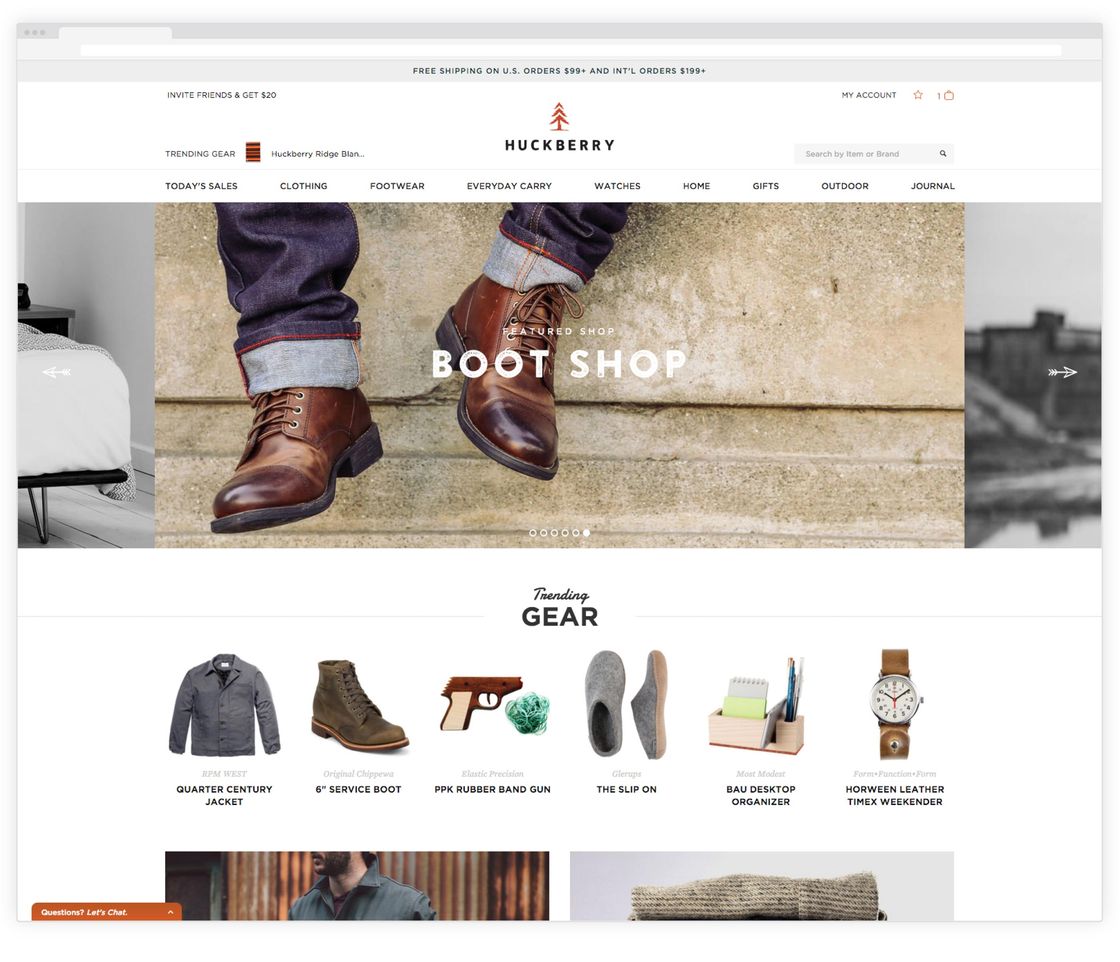
Richard Greiner and Andy Forch started Huckberry in their apartment in 2011. They reached out to us in the spring of 2013 to help make some improvements to Huckberry’s mobile experience, and in early 2014, after almost a year of working together, we decided to begin working a new version of the site. We rebuilt every aspect of Huckberry, from the customer to the warehouse, and launched in June of 2014 after migrating all of the products, customer accounts, and orders. Since then, we've had an ongoing relationship with Huckberry, continuing to improve the site, helping to make high-level decisions about architecture and technologies, and overseeing a rotating cast of web developers contributing to the project.
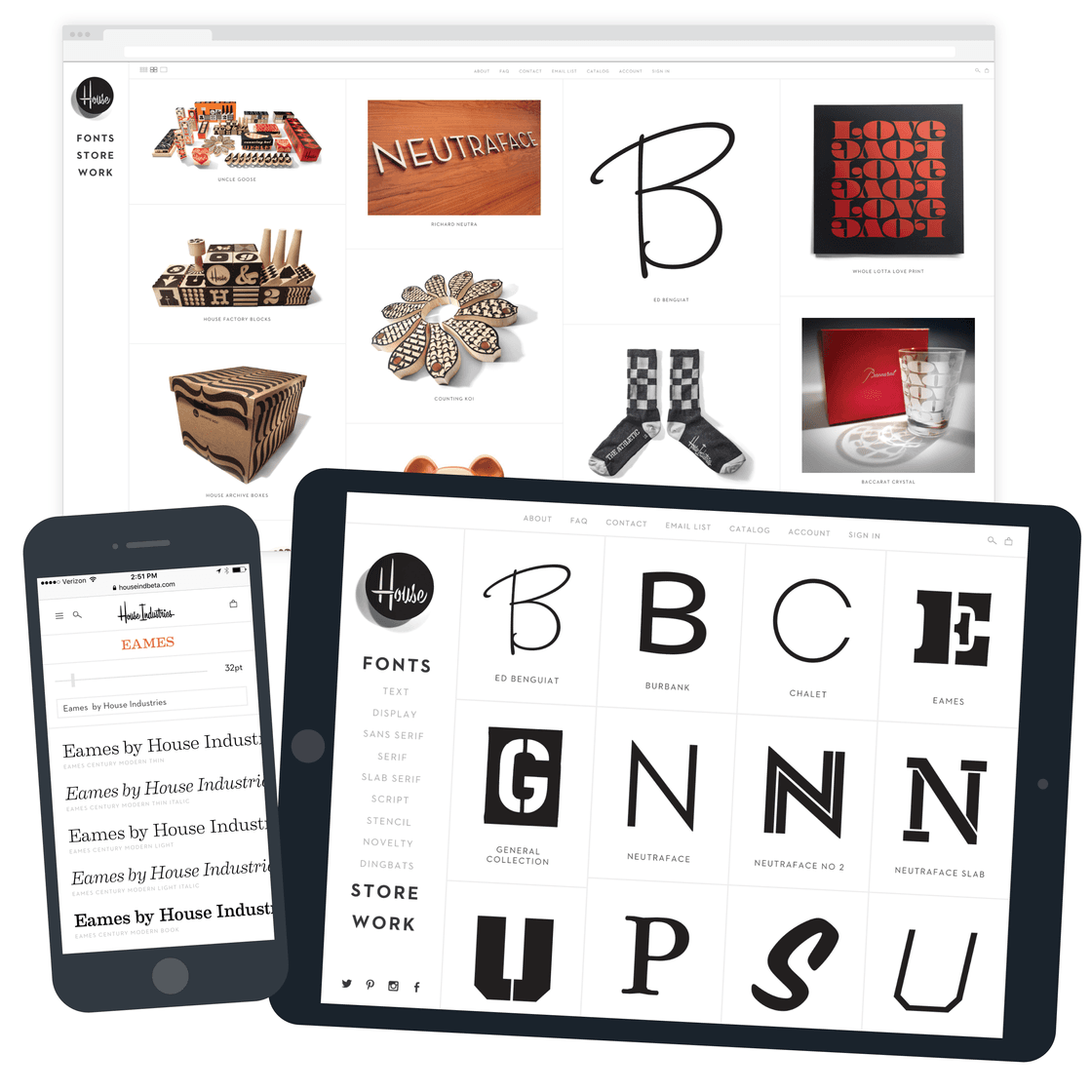
House Industries is primarily a type foundry, designing and selling over 40 font families. Through collaborations with a number of prestigious brands all over the world, they also sell a variety of physical products. After building two different iOS apps for House in 2011 and 2012, we began working together on a site to accommodate the sale of different types of products under one roof. The home page mixes House’s products and type offerings together, emphasizing that even though House works on seemingly unrelated projects, their unique voice always comes through.
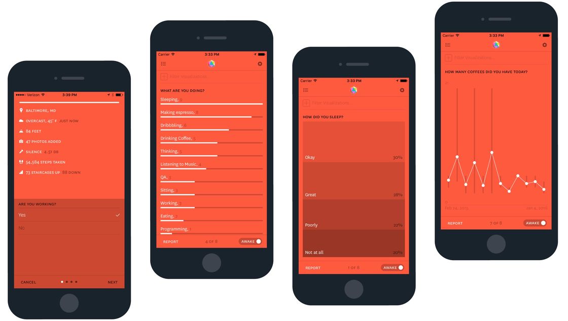
Nick Felton has made a name for himself creating extensive and beautiful annual reports about his personal life every year from 2005 to 2014. In 2012, he commissioned a simple iOS app for his own private use to allow him to track data that typically goes unmeasured with randomly timed, short surveys. In the fall of 2013, we worked with Nick to rebuild this app and bring it to the public, and we’ve been continuing to improve and maintain the app since.
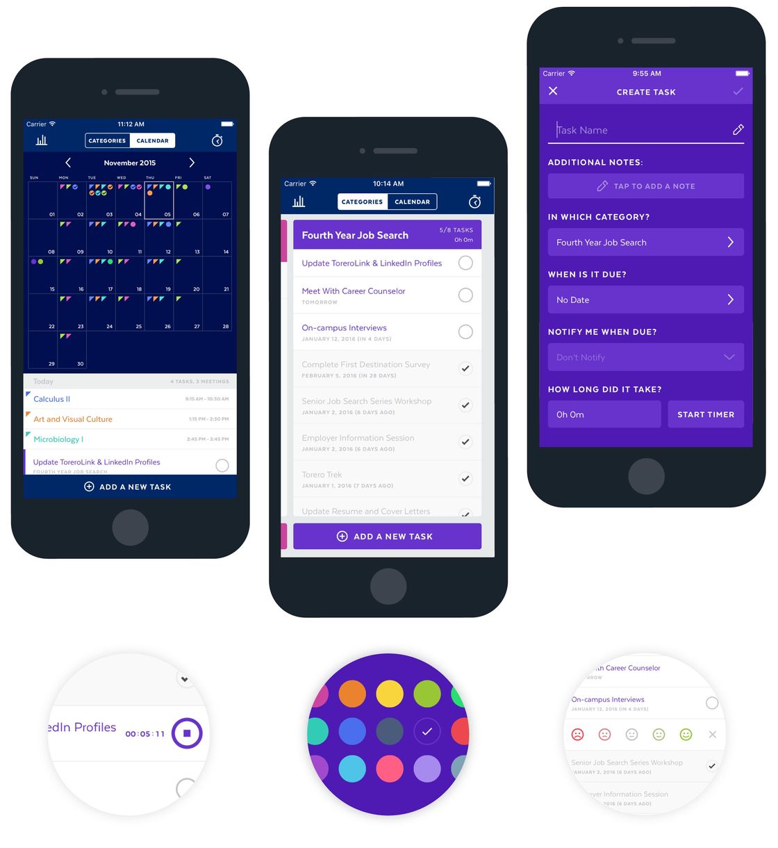
Avi Badwal is committed to making the University of San Diego one of the country’s most tech savvy campuses. During the summer of 2014 we worked with him to design five possible iOS applications to help aid students in their academic endeavors. After carefully considering all the options, we decided to build a to-do list app aimed specifically at college students and taking advantage of information that USD already has available about them. Insight automatically creates lists for each class a student is enrolled in, reminds them of class meeting times, and allows students to track their time spent on specific assignments.
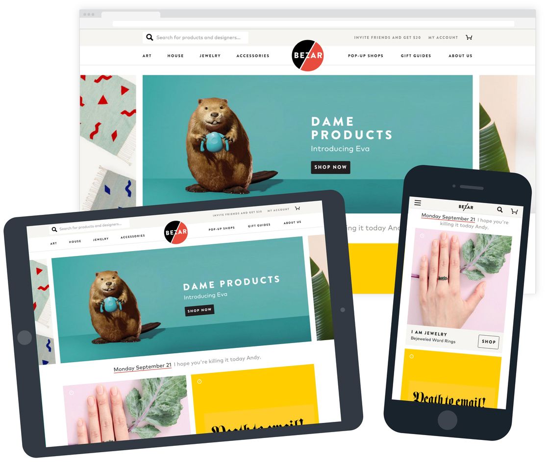
In November of 2014, Fab co-founder Bradford Shellhammer came to us with an ambitious goal: launch a brand new marketplace for designers to sell a variety of products in under four months. We worked closely with Bradford and his team to build and release a referral system in January of 2015 and the first version of Bezar just three months later. The site allowed their team to curate products from hundreds of designers shipped from all over the country and sell those products through a consistent and reliable storefront. Our relationship with Bezar continued through their acquisition in January of 2016.
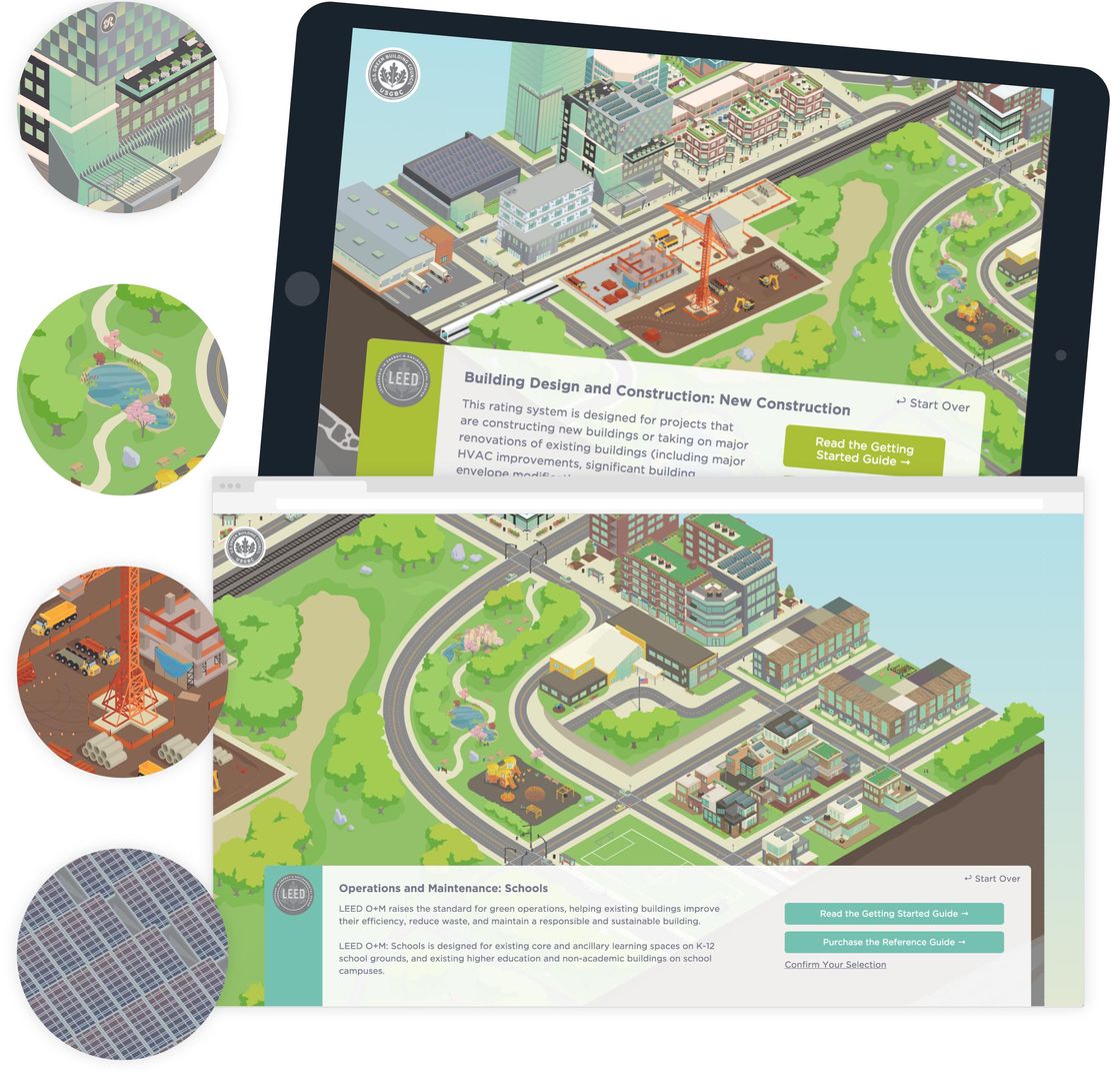
The USGBC’s mission is to promote sustainability in building construction, operations, and maintenance. They developed the LEED rating system to help building owners use resources efficiently and be environmentally responsible. As the rating system grew in complexity, they reached out to us to create a tool that would allow non-technical industry outsiders to understand LEED. We designed, illustrated, and built a website that allows a visitor to the site to answer a few simple questions to better understand which rating systems apply to which projects.
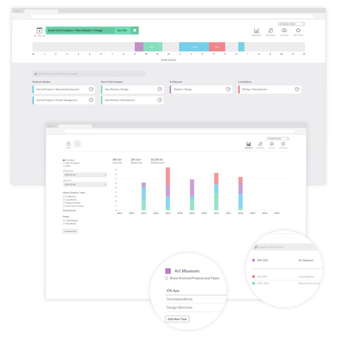
Since starting Friends of The Web in early 2011, we tried many different time tracking and invoicing tools. After a lot of frustration, we decided to start building our own in 2012. We’ve been using Dayswork internally since January of 2013, and in the fall of 2014 we released it to the public. Dayswork features a timeline for viewing and manipulating a user’s recorded tracks, graphs effort on different projects and tasks over time, and creates beautiful and simple PDF invoices.
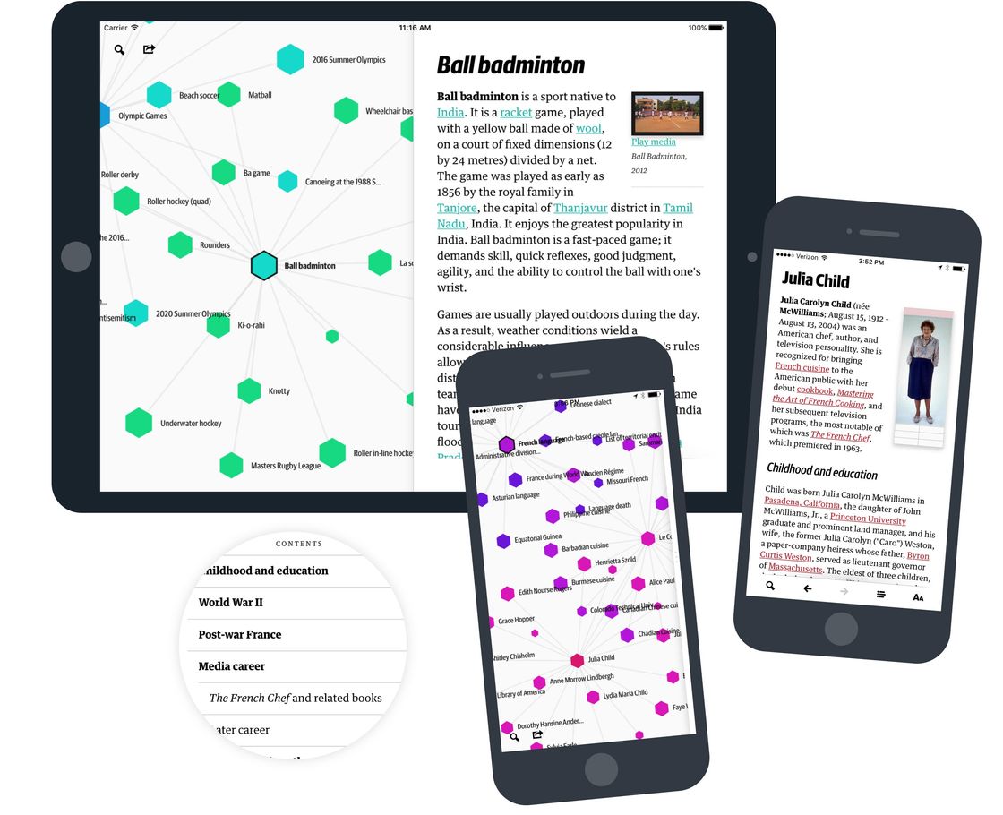
As frequent readers of Wikipedia™, we often find ourselves following links from page to page, learning about topics we didn’t anticipate. The connections between articles, all of which are made manually by contributors, show relationships that sometimes go unnoticed. We built Wikiweb to visualize these links and create a new reading experience for one of our favorite information sources.